Need help positioning your content in Bootstrap? Want to know how to make rows and columns without resorting to using tables? Flexbox is a CSS layout modeling tool that goes well with Boostrap but can also be used with regular CSS3.In this blog post I will inform you how to incorporate Flexbox in your styling, how to make rows and columns, and how to use different positioning techniques for your next project.
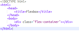
First, let's talk about how to add Flexbox to your project. To add Flexbox, you must create a Flexbox container. You create a Flexbox container by first creating a html element that will be your container for your content that you would like to manipulate.
After doing that, go to your CSS stylesheet or main.scss file and call your container element as a selector. When calling your container element as a selector, add the display property with the value of flex or inline-flex.
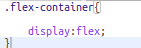
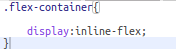
The value flex makes the container itself behave as a block element, while the inline-flex value will make the container act like an inline element.
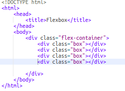
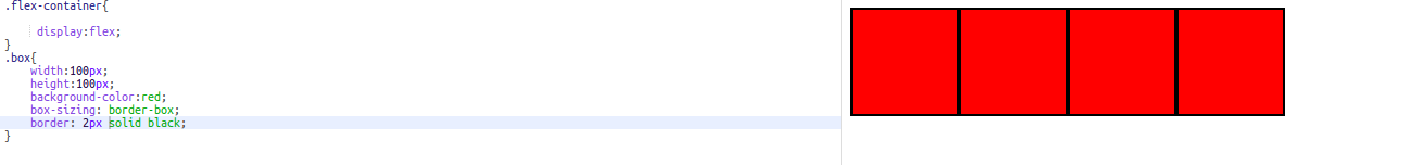
Then, let's style each of these box divs with the width/height of 100px and add a background color. Let us also add a border for each of the boxes to better recognize them and add the property border-sizing with the value border-box to make sure that our boxes remain 100px in width and height throughout the example.
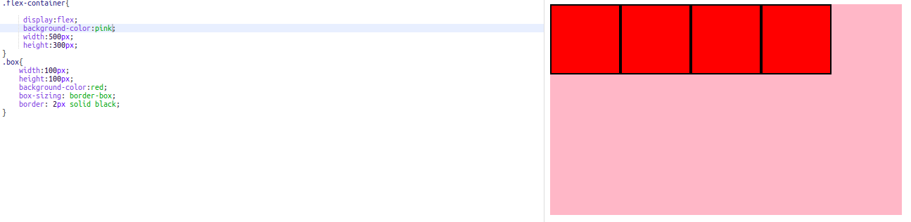
Now, let us also add additional styling to our container of about 500px width and 300px height to make our container visible.
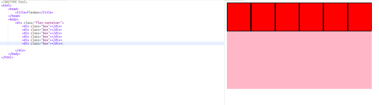
As you can see, all four of our boxes are in one row to your top left corner of our container. The reason for this is due to our flex-direction by default is row, also known as our x-axis or main axis. If we continued to add boxes in our container, then then our flexbox container will shrink our boxes to make them fit on the first row.
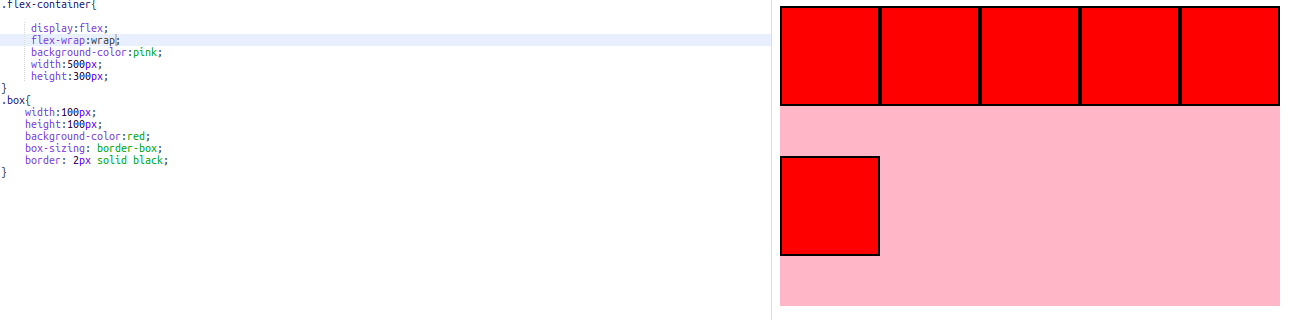
Well, what if we don’t want our boxes to shrink and want them to be in multiple rows instead? We can remedy this by using the property flex-wrap and providing the value wrap. What this will do is push the boxes from the first row that didn’t fit the width of the container to the next row of the container and returns the original width of the boxes.
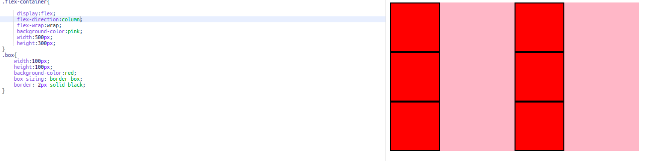
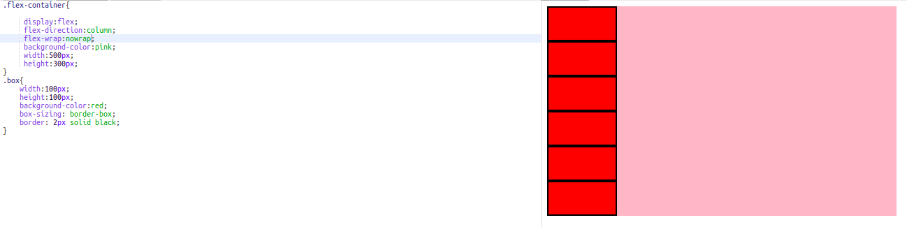
What if we wanted to make columns instead of rows? To do this, we will need to change the flex-direction property value from row to column, also known as the y-axis or cross axis.This will help you produce columns in our container. Just like before, we decide to keep the the flex-wrap value of wrap, then the extra boxes that didn’t fit in the first column will be put in a new column. Otherwise, flexbox will try to shrink the boxes so that they will all fit in one column for the left in our container.
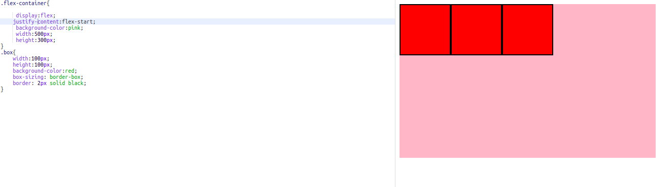
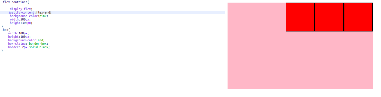
With rows and columns covered, let's talk about the different ways we can position the content within a Flex container. There are two properties that are used to horizontally and vertically align your content within a container. These properties are justify-content and align-items. These properties are dependent on the flex-direction of your container.
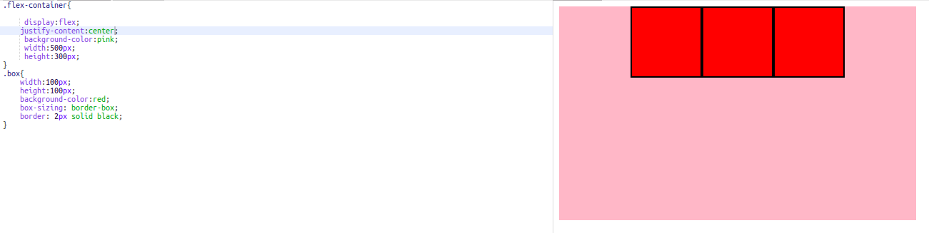
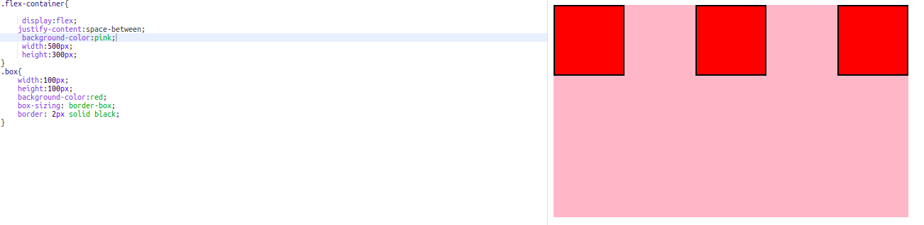
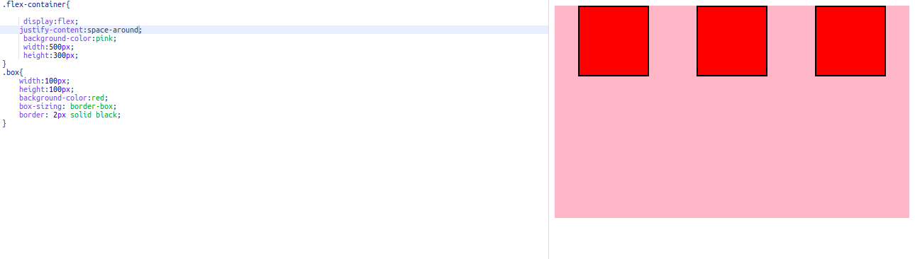
By default, the flex-direction is row. So when you use the property justify-content it will affect the horizontal positioning of your content. The Justify-content property has five values. These values are flex-start, flex-end, center, space-around and space-between. Let’s look at each of these and see how each value affects the positioning of the boxes in the container with the flex-direction is set to row.
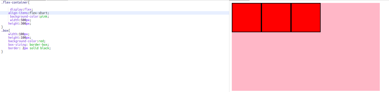
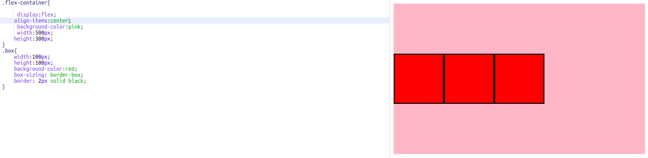
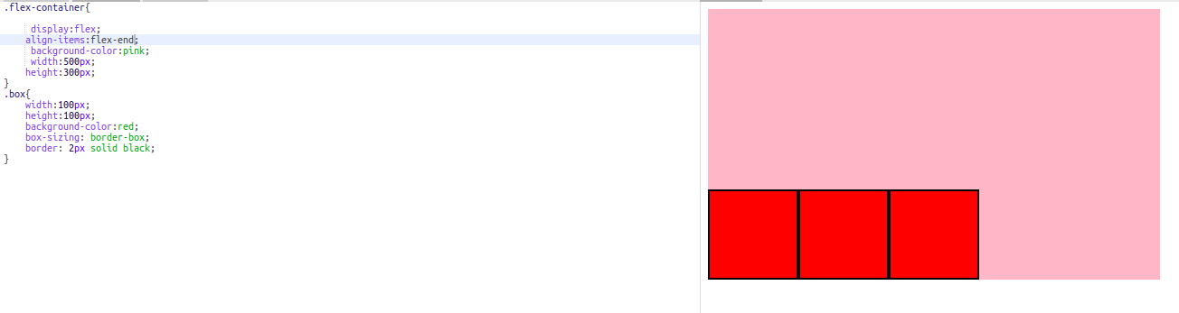
As for the vertical alignment of the items, the align-items property manipulates the vertical alignment of the content while the container’s flex-direction is set to row. There are three values of align-items that I would like to focus on. These values are flex-start, flex-end and center.
When using justify-content and align-items in the column flex-direction, the roles of these two properties are reversed. Justify-content positions the content in the container vertically and align-items will position the contents horizontally.
In conclusion, I went over how to incorporate the flexbox layout, how to make rows and columns using flexbox and showed some techniques on how to position the content within a flex container. If you need any further help in positioning your content, then you can go to this site called Flexbox cheatsheet to guide you in using flexbox. You can also go to the Ultimate Flexbox Cheat Sheet to continue mastering flexbox.